6 ways to keep your website appealing
Did you know that it only takes the average person 3 second to decide whether they are going to engage with your website? So you need to make a great impression – and fast!
Here at Kady Creative, we create beautiful and strategic websites for our clients daily. So it’s safe to say we have picked up a few tricks for creating a beautiful website! So if you’re feeling unimpressed with your site or even have a bad case of website shame, make sure to keep watching as this video is for you!
1. Add a parallax scroll
You can add a really engaging and interactive functionality to your website by introducing parallax scrolls in certain sections of your website. Simply put, this is just an image that reveals itself as you scroll down the page.
2. Add an announcement bar
An announcement bar is the sticky bar you sometimes see at the very top of a web page. What’s great about these is it grabs peoples attention and you can link to any announcements or upcoming news you may have. Sometimes things can get buried on your site when you have a lot of pages and content so this feature is great to highlight a focus for you really easily.
3. Use a carousel or video instead of a static image
Adding some movement into your website is a great way to make it more interesting. Why not change your image tiles to a carousel of images, video or even a GIF?
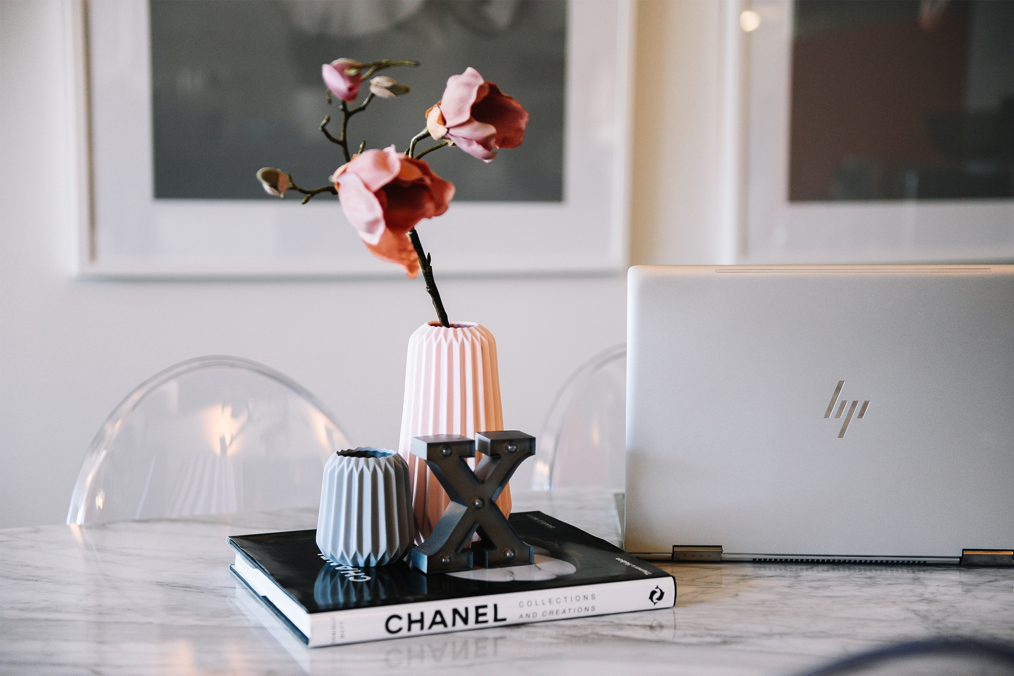
4. Add some quirky design elements
There is nothing worse than a website that looks really blocky and resembles a word document! Try adding some illustrations or graphics to make it more interesting. Make sure you resist the temptation to clutter up the website here though. You need to balance the graphics with clean white space so it doesn’t become overwhelming. And it is also important to make sure you stick with one style of illustration so you can keep the website consistant.
5. Use full bleed coloured backgrounds to break up the page
When you have no sections that break up a website, it can become very overwhelming for the viewer and they don’t know where to focus. It’s always daunting seeing one big chunk or block of text and is very tempting to just click off the site right away. But by having seperate and distinct sections with full bleed coloured backgrounds, it makes it much easier on the eye and much easier to scan and continue reading through.
6. Add a sticky newsletter bar
A sticky newsletter bar can keep the website feeling dynamic and engaging as you interact with the site. It’s also a great way to encourage more sign ups to your list which is win-win!